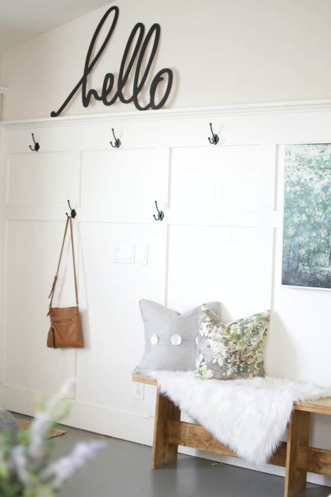
That title is a bold claim, but after 7 years of having the same paint color in all the common areas of my home and not being tired or annoyed of my wall color, I feel like I can make this claim, that today I am in fact going to share with you the best subtle griege paint color for your home. All the common areas of my home are painted Edgecomb Grey by Benjamin Moore. If you’re planning on doing a big remodeling or renovation project in your home in which you’re going to give the rooms a fresh coat of paint, you may want to consider home improvement loans from SoFi to help you pay for the paint, materials, and labor to get the transformation underway.
What makes Edgecomb Grey such a good choice?
It is a barely there color, which makes it easy to live with through the years, but it also has just the right amount of color. This color could give out that elegant look and if you hire NJ exterior painters (or one in your locality), they could help in increasing your home value with just a coat of paint. Here’s what I mean, white walls, white furniture, white cabinets, white all the things are all the rage lately. Being a white lover myself, I really feel like using white in the right places makes all the difference. For example, I really enjoy the pop of white of my built-in woodwork and furniture pieces against Edgecomb Grey. But, when you paint your walls white and then add board and batten or other built-in details, I feel like you almost lose the statement that they can make in your home. Actually! I might ask these questions to the professional painters of companies similar to Handyman Hunter, to whom I can refer, and get a sense of how it might look in the end and maybe hire them if I like their ideas.
Does Edgecomb Grey lean more grey or tan?
According to me, it highly depends on what you pair it with, it’s somewhat of a chameleon. It certainly has strong tan undertones without being yellow at all. However, I will say that my favorite feature of this particular color is that it never feels cold. Cold grey walls are perhaps my worst nemesis. I feel like a lot of times people over do the grey and white and forget to factor in the need for warmth. I love a cozy space but I also love a light and airy space. I achieve this by being mindful of the undertones in the pieces I bring into my house. I feel like the biggest mistake I see in paint colors when I walk into design clients homes is that they chose a cooler grey that makes their home feel cold instead of inviting.